Wednesday, April 17, 2024

The 2024 Cicadapocalypse

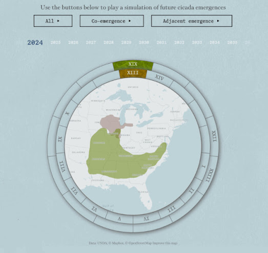
a cicada brood map showing in which year cicada broods will emerge in the USA

2024 is set to see the emergence of two large periodical cicada broods. Both Brood XIX (13-year cicada) and Brood XIII (17-year cicada), are expected to emerge together in 2024 for the first time since 1803. This double emergence has been nicknamed a "cicada-geddon" by some.

Periodical cicadas are native to eastern North America. They spend most of their lives underground as nymphs, feeding on tree root fluids. Depending on the species, they live either 13 or 17 years underground before emerging as adults. As adults periodical cicadas emerge in massive groups called broods. Nearly all the individuals in a brood emerge above ground within a few weeks of each other.

Axios has created a mapped timeline to visualize in which year and where in the USA each of the 13-year cicada and 17-year will emerge and in which year there will be a double emergence. In this visualization a map of the eastern USA is encompassed by two time wheels (a 13-year and 17-year time wheel). Select a year on this map and the two time wheels rotate to show you which broods (if any) will emerge that year.

The Axios article Is 2024 the Cicadapocalypse or a Cicadapalooza? also includes an interactive map which allows you to enter a city in the eastern USA to see in which years the city will experience a cicada brood emergence. 

map showing past sightings of cicada broods
According to the University Of Connecticut's overview of the 2024 Periodical Cicada Emergence, although both Brood XIX and Brood XIII will emerge in 2024 they will "not overlap to any significant extent." 

The university has mapped out past positive presence records of both Brood XIX and Brood XIII. On this map positive presence records of Brood XIII are represented by images of upwards facing cicadas and positive presence records of Brood XIX are represented by images of downwards facing cicadas. The map allows you to see where the two broods have emerged in previous years.

The university also says that even if both broods do emerge in the same area there probably won't be a higher density of cicadas than if only one brood emerged, because "Competition for resources (e.g., food, space, or ovipisition sites) is expected to impose an upper limit on cicada densities".

Monday, April 15, 2024

Backdrop - the Ultimate Challenge

a creenshot of Backdrop showing a map and landscape painting of a church in Warsaw
Backdrop

Backdrop is a map based game which is somewhat similar to the very popular GeoGuessr game. However in Backdrop instead of Google Maps Street View images you have to identify the locations depicted in famous paintings by some of history's greatest artists.

In GeoGuessr you can stroll around in Street View to pick-up clues as to the location that you have been dropped in. In Backdrop if you don't immediately recognize the scene depicted in the painting there are only a couple of clues available to you. Usually the title of the painting is a huge clue as to the location that is depicted. If that doesn't help then the name of the gallery might be a clue as to the location shown in the artwork (although it might also be a complete red herring). 

Currently there are around 200 paintings from around the world in the Backdrop database. Each game of Backdrop involves identifying the locations of 5 paintings chosen at random. You win points based purely on how close you click to the correct location.

Backdrop.Tripgeo

A couple of months ago I gave Tripgeo a preview of Backdrop and he pointed out that the game could work equally well with any type of image. He volunteered to create an editor that could be used to create a Backdrop game with any uploaded images. The result is Backdrop.Tripgeo, a series of GeoGuessr type games, using paintings, vintage photos, postcards, movie stills and holiday snaps.

The Backdrop editor developed by Tripgeo means that it is very easy and quick to create individual Backdrop games. If you have some images that you think might make a good game get in contact and we might be able to help you turn them into your very own Backdrop map game.

Spikkin Scots

The Shetland Dialect map allows you to listen to examples of the Shetland Dialect spoken across the Shetland Isles. The Shetland Isles are the northernmost region of the United Kingdom, Shetland, positioned between Orkney, the Faroe Islands, and Norway. 

Due to the isolated geography of the Shetland Isles the Shetland dialect (also called Shetlandic or auld Shetland) has continued to retain a degree of autonomy from other Scottish dialects. If you click on the green speaker icons on the Shetland Dialect map you can listen to a short sound clip of a Shetlander speaking in their local dialect.

Unfortunately the sound recordings are not accompanied by transcripts. This is a shame.  It would be very useful to be able to see some of these examples of Shetlandic vocabulary and grammatical forms written down. However if you do struggle with any individual words then you can always refer to the Shetland Dialect's Shetland Dictionary, which also includes sound recordings of individual Shetlandic words

The Scottish newspaper the Press and Journal has published a series of articles about the Scots language. This series includes a Spikkin Scots interactive map which features a number of sound recordings of people speaking Scots across the whole of Scotland. 

The newspaper estimates that there are currently around 1.5 million Scots speakers in Scotland. Scots is classed as a vulnerable language by Unesco. 

The Scots language has many dialects. You can explore and listen to these dialects on the Press and Journal's interactive map. The map includes 14 different sound recordings of people speaking Scots in different parts of Scotland (and one Scots speaker in Ulster). 

The map features at least 13 distinct dialects of Scots. Each of the sound recordings provides an example of a person speaking who actually lives and works in the mapped location.

Links to the other articles in the Press and Journal's Scots language series are provided beneath the map, at the end of the accompanying article.


The Scots Syntax Atlas is another interactive map which includes recordings of the Scottish dialects spoken in the different areas of Scotland. The map includes sound recordings of Scottish syntax recorded in all parts of the country, allowing you to explore where and how different types of Scottish syntax are spoken in different areas of Scotland. 

To create the map the researchers visited 145 communities in Scotland interviewing local people and recording their answers. In these interviews the researchers were particularly interested in the syntax of local dialects and in the ways that sentences are constructed in the different areas of Scotland. 

If you click on the markers on the map you can listen to interesting examples of Scottish syntax which were recorded in different parts of the country. You can also discover where these different types of Scottish syntax are spoken by selecting the 'who says what where' button. This option shows you where different types of syntax are spoken in Scotland. The 'stories behind the examples' button provides more detailed grammatical explanations of the recorded examples of Scottish syntax and information on how Scottish syntax differs from  'standard' English.

GeoGuessr for Art

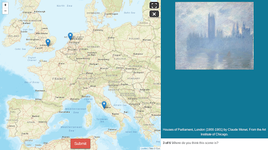
screenshot of the game Backdrop, showing a map and a painting of the Houses of Parliament

Calling all art sleuths and geography buffs! There's a new game in town that will test your knowledge of both the artistic and the actual world. Buckle up, because Backdrop is here to take you on a virtual journey through the works of the world's most famous artists.

Inspired by the wildly popular GeoGuessr, Backdrop throws you into the heart of stunning landscapes and iconic cityscapes, all captured within renowned works of art. But instead of streets and buildings, you'll be navigating brushstrokes and artistic composition.

Here's how it works:

  • Study a famous painting
  • Pinpoint the location depicted in the artwork by clicking on an interactive map.

It is that simple. Think you can recognize the rolling hills of Tuscany from a snippet of a Renaissance masterpiece? Or perhaps the bustling Parisian streets in the background of a Monet? Backdrop will put your location recognition skills to the test, all while challenging you to identify the locations shown in famous works of art.

However Backdrop is not just restricted to famous works of art. The game also works with all other types of images. Therefore as well as identifying the locations depicted in famous works of art you can play Backdrop rounds which involve identifying the locations in some of the world's earliest photographs, the scenes captured in vintage postcards, in pixelated Street View images, in famous movie scenes and in some of my own personal photos of London. 

And more rounds will be coming soon ... (such as images of famous cat explorers). There are also plans a foot to maybe open up Backdrop so that registered users can create their own games from their own photos.

You can also play Backdrop - the Ultimate Challenge. This is very similar to the Art Attack game on Backdrop but actually selects random paintings from around 200 different works of art.

Saturday, April 13, 2024

The AI Music Map

Over the last few days my Twitter feed has been lit up by people sharing the songs that they have created on Udio. For the one or two cave dwellers out there who have only just installed spelunking wi-fi, Udio is an AI-powered music generation tool which allows users to create songs from a text prompt. The tool allows you to create tunes with customized lyrics, vocal styles, and musical genres.

Because I happen to follow a lot of cartographers and geographers many of the AI songs I have seen on Twitter have a map theme. However Darren Wiens has to get a special mention for creating the first Udio-map mash-up. His Longitunes interactive globe allows you to click on lines of longitude around the world to listen to an AI-generated song about that specific pole-to-pole segment of the Earth.

Of course using music as a navigational aide isn't new. Long before maps and compasses were invented the indigenous people of Australia were able to navigate using the songlines of the Gods. Songlines, or dreaming tracks, are the creation myths of Indigenous Australians. They are the paths that the creator-beings took across the world while naming and creating the features of the land. 

These songlines crisscross Australia and, if you know the songline, you can follow the routes that the creator-beings took across the country. By singing the songlines indigenous people can actually navigate vast distances, often travelling through the deserts of Australia's interior. You can learn more about songlines from different parts of Australia on ABC's Singing the Country into Life, which explores the songlines of a number of indigenous groups across the whole of Australia.

Friday, April 12, 2024

The 2024 Submarine Cable Map

the 2024 submarine cable map presented as a globe

Every year the telecommunications company Telegeography releases a new, updated version of its Submarine Cable map. This map shows all the undersea telecommunication cables which carry data around the world.The 2024 Submarine Cable Map is now available. 

Subsea cables carry telecommunication signals under the oceans, communicating information between different countries and regions of the world. In the 19th Century the first submarine cables were laid to carry telegraphy traffic. In the 21st Century submarine cables carry digital data. This includes all our telephone and Internet data.

This year's version of Telegeography's undersea cable map plots 529 cable systems and 1,444 landing stations. The 2024 Submarine Cable map is available as a free download or you can purchase a wall map for $250. In previous years Telegeography has often experimented with different vintage map styles. This year's edition is much more straightforward (which is probably the most sensible design choice). 

One interesting cartographic choice in this year's edition of the map is the positioning of some of the inset maps on top of the massive Russian landmass. These inset maps provide a close-up view of country landing stations and the cable systems which they serve around the world. Normally you might expect inset maps to be positioned in the ocean, and in the corners of a map. However because the major focus of a submarine cable map is the oceans and coastlines it makes sense to position inset maps inland (although the central prominence of the Egypt hub makes little geographical sense and may owe more to the fact that the map is sponsored by Telecom Egypt). 

You can explore Telegeography's Submarine Cable Maps for previous years just by changing the year in the map's URL. For example, one of my favorite Telegeography maps can be found at http://submarine-cable-map-2015.telegeography.com/. This 2015 map was inspired by medieval and renaissance cartography and features a vintage map style containing sea monsters, cartouches and border illustrations.

Wednesday, April 10, 2024

Mapping Conflicts Around the World

In 2024 the specter of military conflicts haunts the world. Israel is engaged in conflict in Gaza, Russia continues its illegal invasion of Ukraine and the Syrian civil war is now in its thirteenth year. It should be a matter of extreme shame that there are so many organizations who feel the need to publish interactive maps dedicated to tracking the progress of military action around the globe.
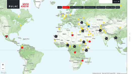
map of armed conflicts around the world

The Geneva Academy's The Rule of Law in Armed Conflict Map monitors and plots armed conflicts around the globe. The map currently shows the locations of  more than 110 armed conflicts, including the military occupation of Palestine by Israel and the occupation of parts of Ukraine by Russia.

The Rule of Law in Armed Conflicts (RULAC) online portal has been mapped armed conflicts around the world since 2007. The map currently shows that at least "55 states and more than 70 armed non-State actors" are presently involved in armed conflicts. 

If you click on the yellow country markers on the map you can discover which conflicts the selected country is currently involved in. For example if you click on the United States the map reveals that the US is presently involved in "airstrikes in Iraq and Syria" and is "also undertaking strikes against Islamist militants in Somalia, Pakistan, Libya and Yemen."

According to the International Institute for Strategic Studies (IISS) the intensity of conflicts around the world increased last year with the number of people dying in these conflicts increasing by 14% year-on-year.

The IISS is an international research institute (or think tank) focused on global security, political risk, and military conflict. The IISS Conflict Trends Map plots the fall and rise of conflicts around the world based on the result of the institute's annual Armed Conflict Survey. The interactive conflict trends map plots five main criteria: troop deployments, violent events, fatalities, the number of internally displaced persons and the number of refugees.

The map also includes a timeline control which allows you to track conflicts in countries around the world over time. Press the play button on this timeline and you can view an animated choropleth layer visualizing the progress of global conflicts for the years 2014-2023.
The Center for Preventative Action's Global Conflict Tracker is another interactive map which tracks conflicts around the world. The Center for Preventive Action (CPA) is a think tank based in Washington, D.C., affiliated with the Council on Foreign Relations. It has a specific focus on conflicts which affect 'U.S. interests'.

The Global Conflict Tracker allows you to filter the conflicts shown on the map by status (worsening, unchanging or improving). The map can also be filtered to show conflicts which have a 'critical', 'significant' or 'limited' impact on the United States. If you click on any of the conflicts shown on the map you are taken to the CPA's page on the conflict, which includes background information, a summary of concerns and news of any recent developments. 

The ACLED Conflict Severity Index (from the The Armed Conflict Location & Event Data Project) uses four different indicators to assess and rank the complexity and severity of conflicts in countries across the world. Based on violence measured in countries around the globe in 2022 the Index identified 46 countries and territories which were experiencing severe levels of conflict. 

You can explore Conflict Severity Index rankings for individual countries and the 46 countries identified with severe levels of conflict on ACLED's interactive map (based on 2022 conflicts). The map includes a choropleth layer which shows the number of incidents of political violence in each country. In 2022 political violence was seen in nearly every country and in many countries the incidents and number of incidents were considered severe by the ACLED. The ACLED has yet to publish it 2023 report.

Canada's Hidden Subterranean Rivers

map of Toronto's hidden rivers transitioning into an overhead video

Canadian cities, like many cities around the world, have a history of hiding waterways underground. As cities grow rivers can become obstacles to the movement of people, can be seen as wasted real-estate, and historically (when cities had poor sanitation) they often became open sewers. For these reasons cities often culvert and divert rivers underground.

In Discover Where Ancient Rivers Flow CBC has mapped out the hidden subterranean waterways of Toronto, Montreal and Vancouver. These maps are used to take the reader on a tour of each city's underground rivers. These story-map tours are filled with some wonderful transitions between the map and  overhead drone captured imagery. For example in the screenshot above CBC seamlessly transitions between the map and an overhead video of a multi-lane highway.

There is a growing movement in many cities around the world to "daylight" urban rivers, to return them to the surface. This can improve water quality, create recreational spaces, and reconnect people with nature in the city. CBC explores the argument that resurfacing urban waterways can help cities deal with "heat islands, flooding, pollution, and (the) loss of ecosystem diversity". 

If you live in Toronto, Montreal and Vancouver you might want to scroll to the end of Discover Where Ancient Rivers Flow where you can explore for yourself the locations of each city's underground hidden rivers on an interactive map.

Via: Datawrapper

Tuesday, April 09, 2024

15 Minute US Cities

map of Los Angeles showing 15 minute neighborhoods

The idea of the 15 Minute City is that urban living is much more enjoyable and sustainable when all our essential needs are close by. These essential needs include such things as grocery stores, health care facilities, cultural attractions, transit stops, educational facilities and leisure activities. Individuals living in a 15 Minute neighborhood should be able to access all these essential health, educational, retail and leisure needs within a short fifteen minute walk or bike ride.

Last week Nat Henry released a new interactive map which allows users to discover walkable, bikeable, and transit-friendly neighborhoods across the United States. Close allows users to select the amenities & destinations which are important to them and then it creates a US travel-time map based on walking, biking and public transit travel times to those destinations. Which means you can quickly find your ideal 15 minute neighborhoods in towns and cities across the US.

If you are moving home in the near future you can use Close to help identify the best places for you to live based on your own personal life choices. Using the Destinations menu you can select from 35 different amenities and destinations which are important to you. These include destinations such as shops, parks, schools, bars, transit stations, health care etc. 

You can then select a travel-time mode for each of your selected destinations (walking, biking, and walk & transit). When you have finished adding destinations Close will produce an ishochrone map which shows the travel time to the furthest of those amenities. The areas marked blue on this map are the areas where your essential needs will be met without you having to travel long distances.

Monday, April 08, 2024

Live from the Sundhnúkur Eruption

Live webcam view of volcanic activity in Iceland

The Reykjanes peninsula in Iceland has been experiencing a period of heightened volcanic activity since December 2023. This follows an increase in seismic activity that began in late 2019. The most recent eruption started on March 16th in Sundhnúkur near the town of Grindavík.

You can view a live webcam of volcanic activity in Sundhnúkur on Live from Iceland.  This webcam shows a live feed of the eruption near Sundhnúkargigar, north of Grindavik from Mt Þorbjörn.  

animated map showing the increase in seismic activity in Sundhnúkur starting in December 2023

vafri.is/quake is an interactive map of near real-time seismic activity in Iceland. The map uses data from the Icelandic Meteorological Office in order to plot live and historical earthquake data across the country. 

The map's GPS Viewer plots data from GPS stations. GPS stations can monitor seismic activity by recording how far the position of a station is displaced by a seismic event. In the screenshot of the GPS Viewer map above you can see the sudden increase in seismic activity in Sundhnúkur starting in late 2023 and continuing to the present date. 

The arrows on the map visualize the direction and scale of movement recorded by the GPS stations. The yellow and green arrows clearly show the magma dike of the volcanic eruptions in Sundhnúkur pushing land to the northwest (yellow) and southeast (green) of the dike. The blue timeline control allows you to view the GPS displacement data by date.